




Context
Formación Ninja prepares candidates for Spain’s national public service exams, from the Civil Guard to the justice administration. With a new brand, the company is preparing to expand into vocational training.
The sector it operates in is crowded and largely undifferentiated. Most exam academies share the same flat, aseptic codes: blue and green palettes, diffuse communication, and an automated experience where students receive the syllabus and are left to study alone.
Challenge
Formación Ninja already had a strong character, with a methodology that breaks with the traditional way of studying. With an offering this distinctive, the brand had a huge opportunity to reflect it.
The challenge was to build an identity with real intention behind it. It had to stand clearly apart from the competition and accompany students through the whole process, from the first day of study to the exam. It also had to be flexible enough to grow with the company as it moves into new areas of training.
Approach
The strategy rests on two pillars: a community, so no student prepares alone, and a direct, irreverent voice that challenges the system the rest of the market reproduces. From there we defined the brand’s territory, a clandestine dojo where ninjas train together.
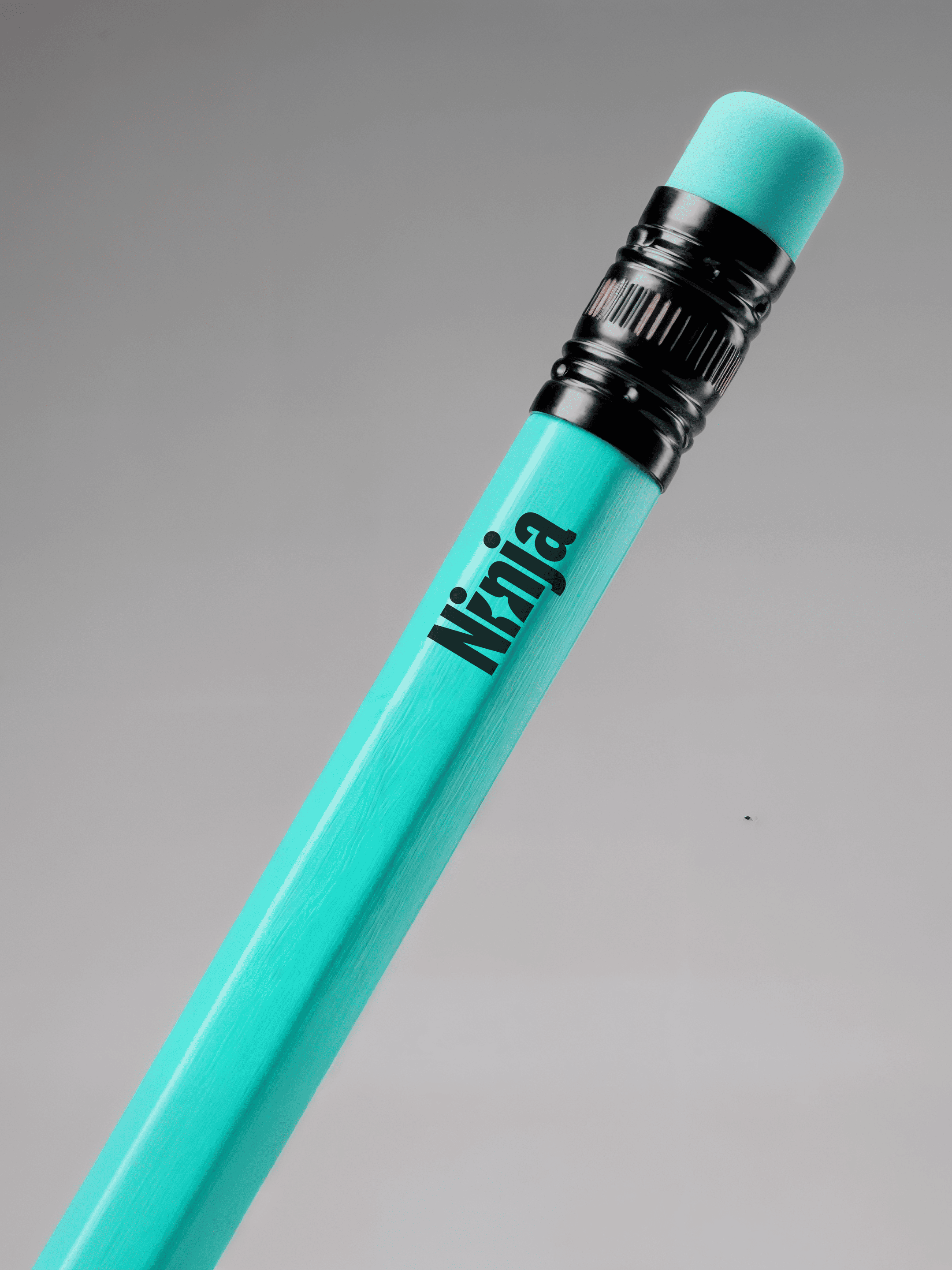
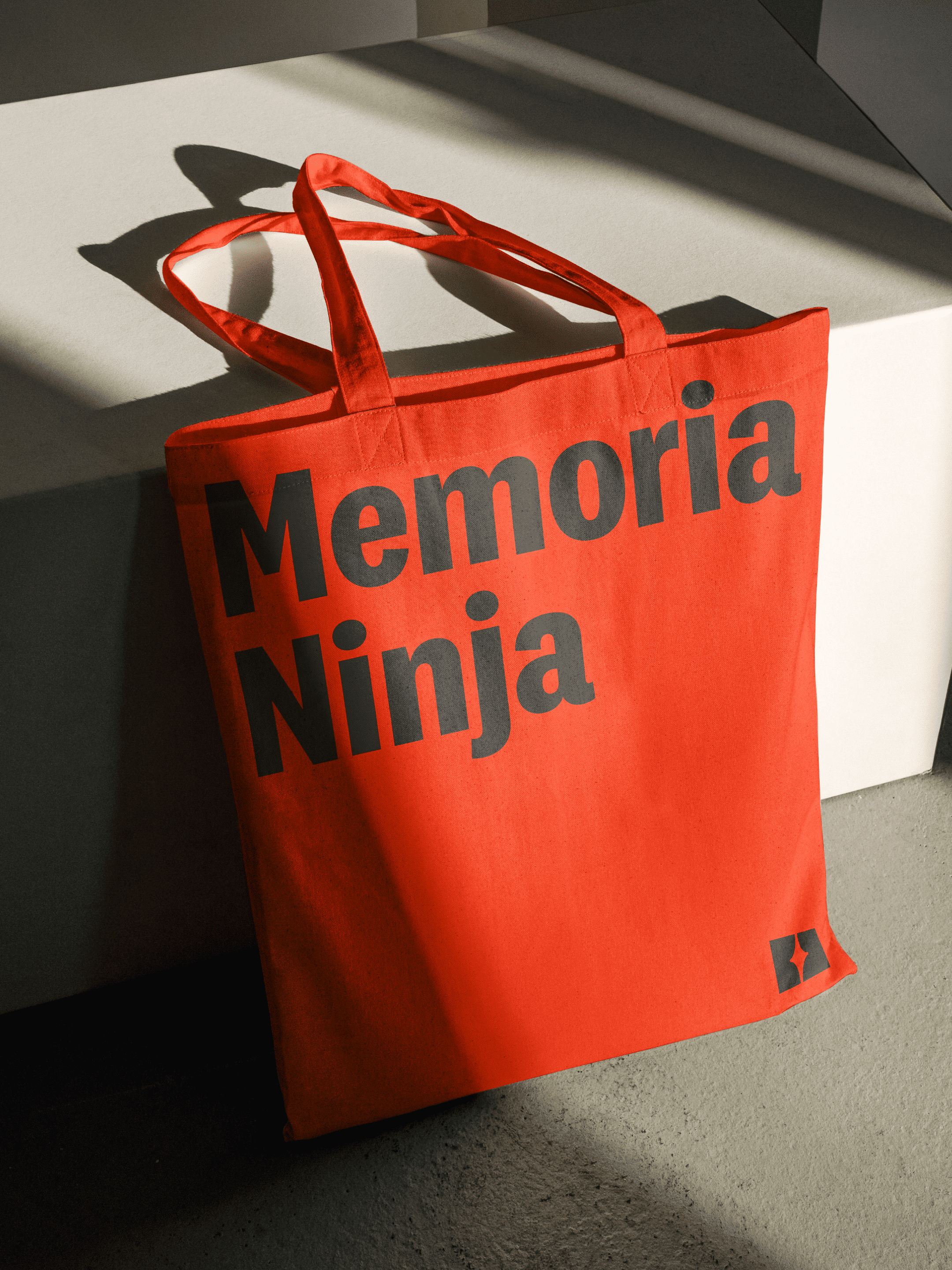
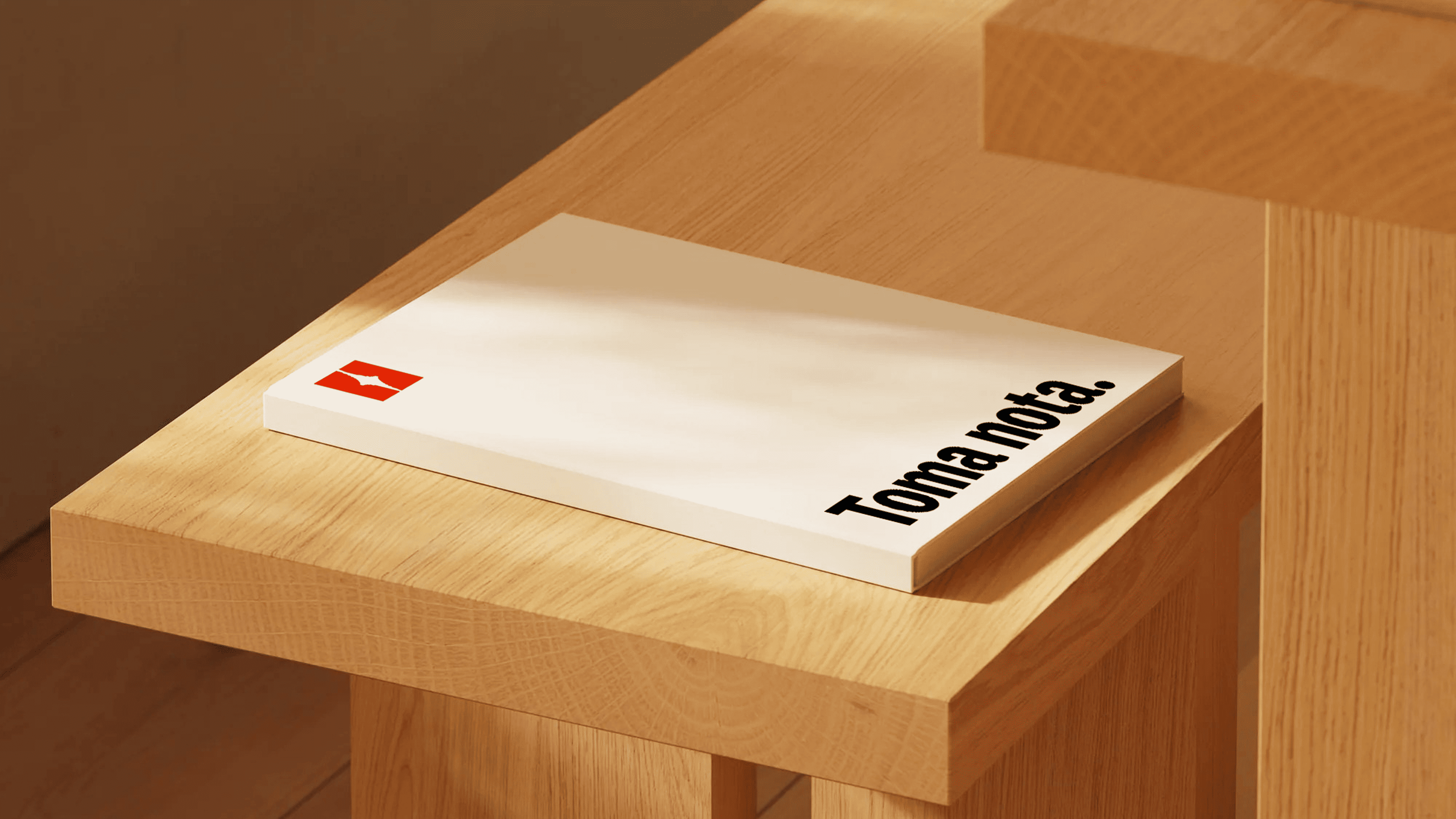
The visual identity moves the brand closer to the codes of today’s digital products. We simplified the name to Ninja and built a shuriken into the counterform of the logo. A condensed humanist sans balances the brand’s irreverence with impact. The palette is mostly black, white and greys, with a blood-orange accent and an aquamarine reserved for moments of progress.
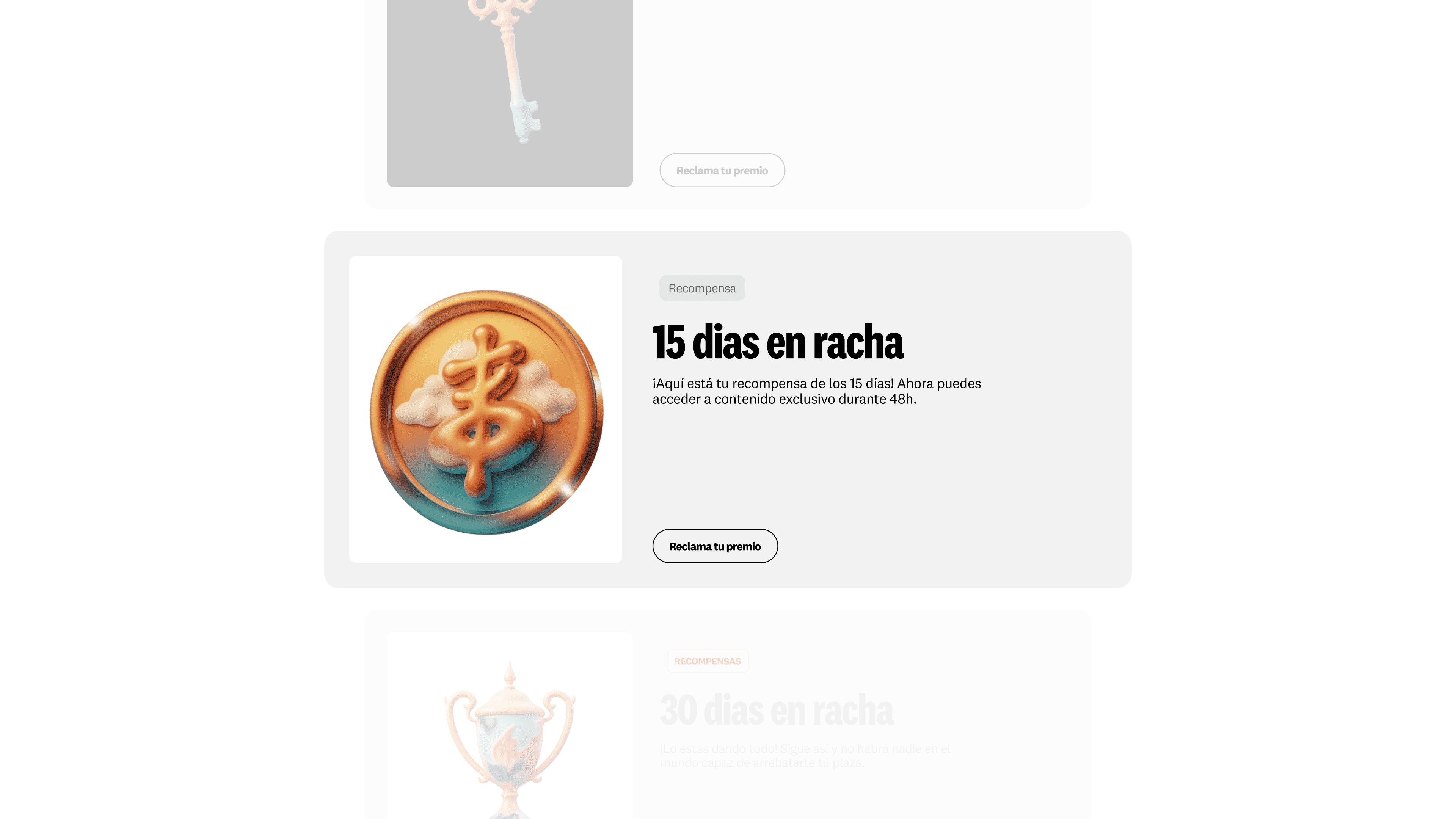
The illustration system draws on surrealism, adapted to an Asian visual universe. It was generated with Krea through a custom engine and prompt that we handed over to the team, so they can keep creating new assets within the same language.
Impact
Formación Ninja now has a brand that matches the way it teaches. It is recognisable in a market of interchangeable players and built around the community it wants to grow.
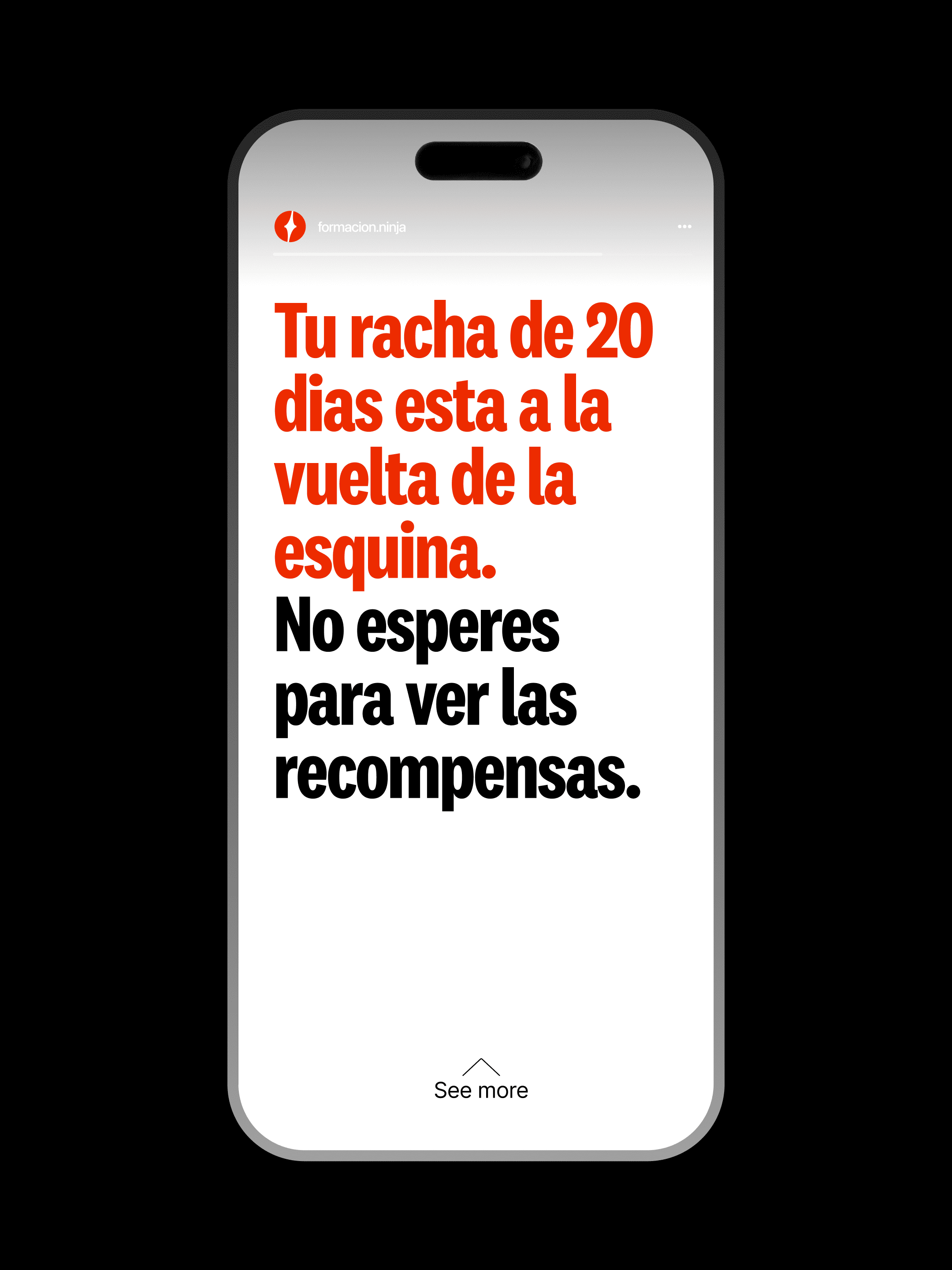
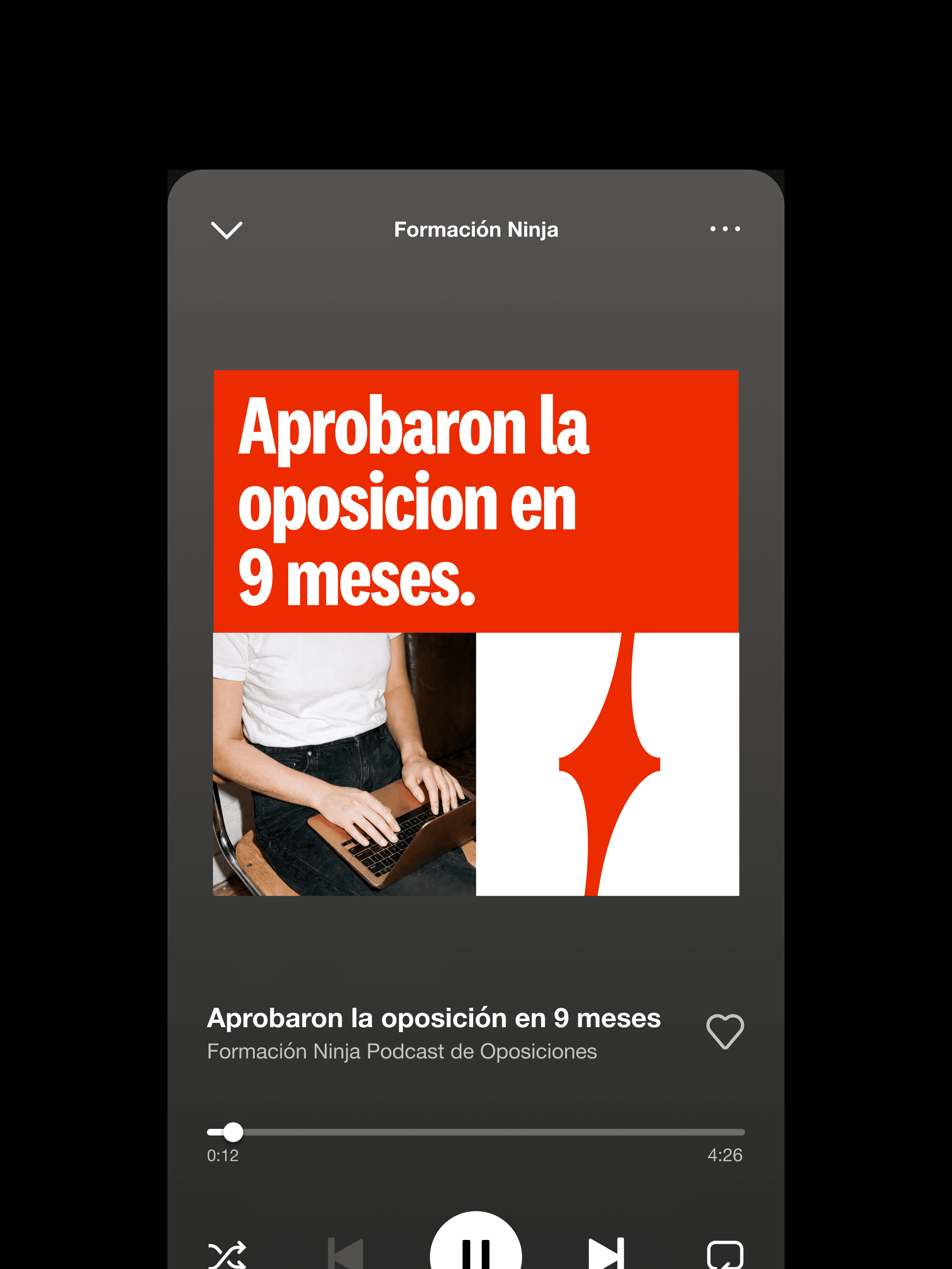
The project was delivered with a complete toolkit and brand book, including templates for Instagram, YouTube, LinkedIn and podcast covers. Together with the generative engine, it gives the team the autonomy to keep producing consistent content as the platform expands into new areas of training.
Expertise
Mendesaltaren team
Paula Montoto
Izan Albujer
Manu Tejero
Context
Formación Ninja prepares candidates for Spain’s national public service exams, from the Civil Guard to the justice administration. With a new brand, the company is preparing to expand into vocational training.
The sector it operates in is crowded and largely undifferentiated. Most exam academies share the same flat, aseptic codes: blue and green palettes, diffuse communication, and an automated experience where students receive the syllabus and are left to study alone.
Challenge
Formación Ninja already had a strong character, with a methodology that breaks with the traditional way of studying. With an offering this distinctive, the brand had a huge opportunity to reflect it.
The challenge was to build an identity with real intention behind it. It had to stand clearly apart from the competition and accompany students through the whole process, from the first day of study to the exam. It also had to be flexible enough to grow with the company as it moves into new areas of training.
Approach
The strategy rests on two pillars: a community, so no student prepares alone, and a direct, irreverent voice that challenges the system the rest of the market reproduces. From there we defined the brand’s territory, a clandestine dojo where ninjas train together.
The visual identity moves the brand closer to the codes of today’s digital products. We simplified the name to Ninja and built a shuriken into the counterform of the logo. A condensed humanist sans balances the brand’s irreverence with impact. The palette is mostly black, white and greys, with a blood-orange accent and an aquamarine reserved for moments of progress.
The illustration system draws on surrealism, adapted to an Asian visual universe. It was generated with Krea through a custom engine and prompt that we handed over to the team, so they can keep creating new assets within the same language.
Impact
Formación Ninja now has a brand that matches the way it teaches. It is recognisable in a market of interchangeable players and built around the community it wants to grow.
The project was delivered with a complete toolkit and brand book, including templates for Instagram, YouTube, LinkedIn and podcast covers. Together with the generative engine, it gives the team the autonomy to keep producing consistent content as the platform expands into new areas of training.


